 Question posted in
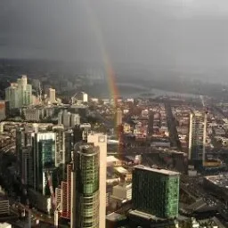


Update 3
I updated the code (http://codepen.io/anon/pen/VYRJLp) and now the edges look really like torn paper effect. It uses SVG by the way.
The only problem is I don’t know how to make the image as the background of the svg AT THE SAME TIME maintain the torn-paper-like edges.
Please have a look it. Any efforts are appreciated.
Update 2
It seems that it is impossible to achieve this effect without the help of PhotoShop(PS), so I would like to add PS as a part of solution.
I am not a PS expert, but from a quick thought, I think there are a few steps I need to do:
- Use PS to create a torn paper "shell", let’s say it’s shell.png It
should only have color on its edges and the color should be white;
the inner area is transparent, so that we can place the picture in
it. - Place shell.png on top of the picture, let’s say banner.jpg, which
means set the z-index of the div which uses shell as its background
image to 1. - Use another div to contain the banner.jpg and set the z-index below
the shell div.
Questions for this approach:
-
Is it responsive?
-
If not, is it possible to make it responsive? As I have to make it
work properly on mobile devices.
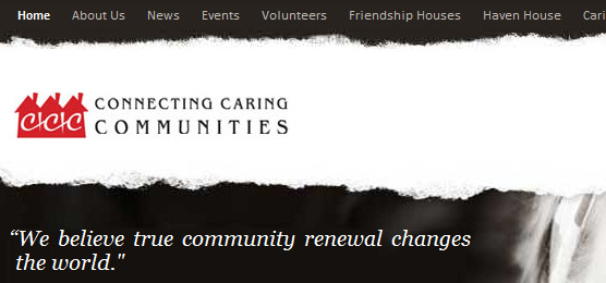
I remember that I saw a beautifully designed website, there is a picture in the background and the edges of this picture look like torn paper effect which is fantastic!
I searched the similar questions here but it turns out that the effects in the answers are primitive, which are very simple rugged black lines.
What I want:
- I want this picture to be as wide as the device screen which means
responsive. - The edges of this picture look like torn paper.
- I will place this picture as a banner after the Top Navigation bar
but before the content.
It should look like the white area in this picture. But in my case, I will need to fill in my picture to replace the white area.
Here is my code:
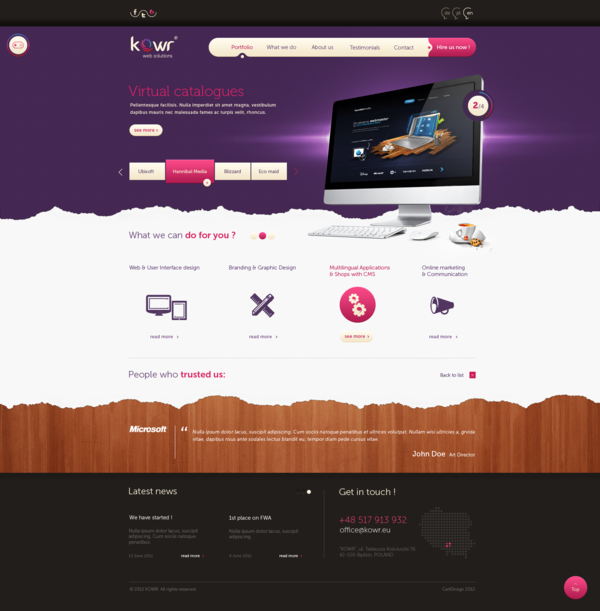
Notice: in this code, the css uses an image as the edge, BUT that is not want I want. I just want the edges to be pure CSS effects.(Is this possible?) So it will look like this one(the one on the right side, you can see that there is no white rugged edges)

<div class="row">
    <div id="letter" class="col-lg-12 col-md-12 col-sm-12 col-xs-12">

    </div>
</div>

#letter { /*torn paper border*/
    height:450px;
    position:relative;
    top:0;
    bottom:0;
    left:0;
    right:0;
    background-image:url('img/background.jpg');
    background-size:cover;
    opacity:0.8;
    border-style: solid;
    border-width: 40px 40px 40px;
       -moz-border-image: url('http://news.unchealthcare.org/images/backgrounds/paper.jpg') 80 80 80 repeat;
    -webkit-border-image: url('http://news.unchealthcare.org/images/backgrounds/paper.jpg') 80 80 80 repeat;
         -o-border-image: url('http://news.unchealthcare.org/images/backgrounds/paper.jpg') 80 80 80 repeat;
            border-image: url('http://news.unchealthcare.org/images/backgrounds/paper.jpg') 80 80 80 repeat;
}
Update
I think I found something quite similar to what I am imagine.
Here is the effect I want:
4
Answers
You could probably achieve this effect with a png image.
The top part should be black (or whatever the color of your header), the bottom is partly transparent to create the “torn effect”, and your real image will be on a lower layer (z-index) to be partly hidden.
Reply to Update2 this is what I meant
Instead of creating a complete shell (a “square” hole), you can split the four edges in four images: top, right, bottom and left.
You can make it responsive by simply repeating the image on the whole length (the “start” and “end” of the four edges must be the same)
*
I was able to do this with CSS using border image slicing.
Here’s the code:
This gives me a height re-sizing div that always has the torn paper effect along the top and bottom. It’s great for full width, but I wasn’t able to figure out a decent way of doing the side edges at the same time as the top and bottom (easy to do the side edges if the top and bottom edges are straight).
I made the image in Photoshop – it’s basically yellow in the middle, then torn and then transparent on the outer.
If you’re not familiar with image slicing, the four numbers basically define (in order): the height in pixels of the top of the image that you want to use as the top border strip, the width in pixels for the right strip, then the bottom strip, then the left strip. The
filltells it to take the center part (which is discarded by default) and use it to fill the div between the borders.Depending on your preferences you can have the border
repeat(and get cut off at the end),round(repeat to the nearest number of full repetitions, which either compresses or stretches depending on which number it is nearer to) orstretch(stretches… although that distorts the image for this example).It took some fiddling for me to get it to work correctly but I’m chuffed with the results. I couldn’t find anyone with the same answer so thought I’d post it.
UPDATE
This feature IS supported in IE11 provided
border-style:solidis specified. I use media queries to provide an alternative (shadows etc.) for IE10 and below whereborder-imageis not supported (example on my website).UPDATE 04/2020
It’s now 2020 and it’s been a few years since my original answer (I’ve learned a lot in 5 years). I recently did this on another project for wooden watches and stuff using a simpler method. I find the div I want to apply the border to and use either
:beforeor:afterto add the border as below. Again, the image I made in Photoshop but this time it’s white > torn edge > transparent rather than coloured.To add to the bottom:
To add to the top (note that you need a flipped version of the image unless you want to transform/rotate it in CSS as well):
Adjust the
height,bottom,widthandleftto suit the image and the website. Note that if you apply this to the footer you can cause issues having a width greater than 100%, in which case you need to keep theleftat zero.This is responsive, but you can use media queries to specify different sizes and margins for mobile if necessary.
The result is the same effect that was originally requested:
Try this:
I used some pen I found to come up with my own solution that has rips on all four sides. You can change it to have rips on only the top, bottom, left, right, or any combination thereof.
The key ingredients:
clip-path: polygon(…)to "cut" the object you want to have the rip effect.filter: drop-shadow(…)on the container to give the thing a shadow.Not only does this give a shadow, but that shadow follows the pattern of the rip so that it looks more realistic.
Live action:
https://codepen.io/carterpape/pen/rNjJKbM