skip to Main Content

I need to add an “outer glow” Photoshop effect to some text using CSS. Here is a screenshot of the mockup of what I am trying to acheive:

enter image description here

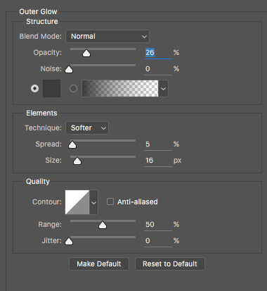
Here is the Photoshop layer settings:

enter image description here

I’m pretty sure this is text-shadow but I’ve been messing around with it and I cannot achieve a glow on all sides.

3

Answers


  1. There has text-shadow, first two values are x and y offsets, third value specifies the shadow blur:

    text-shadow: 0 0 32px black;
    
    body {
      background-color: #00bcd4;
    }
    
    p {
      margin: 30px;
      color: white;
      font-family: sans-serif;
      font-size: 40px;
      font-weight: bold;
      text-shadow: 0 0 32px black;
    }
    <p>Lorem ipsum dolor sit amet</p>
    Login or Signup to reply.
  2. Are you looking for something like this?

    body{
      background-color: #CCAA77;
    }
    div{
      font-size: 40px;
      color: white;
      text-shadow: 0px 0px 30px white,0px 0px 30px white,0px 0px 30px white,0px 0px 10px #553300,0px 0px 10px #553300;
    }
    <div>Protecting From Cancer</div>

    As you can see, you can compound several text-shadow to make them more intense and mixing colors.

    Login or Signup to reply.
  3. Text-shadow is what you have to use to achieve glow or some kind of text-shadow.

    p{
    text-shadow : horizontal-shadow vertical-shadow blur color;
    }
    

    To add multiple text-shadow, you can do that by separating them, by adding comma to text-shadow property.

    p{
        text-shadow : horizontal-shadow vertical-shadow blur color, horizontal-shadow vertical-shadow blur color;
     }
    
    p{
      background:#111;
      color:#fff;
      text-shadow:1px 1px 10px #fff, 1px 1px 10px #ccc;
      font-size:48px;
      text-align:center;
    }
    <p>
    Demo Text
    </p>
    Login or Signup to reply.
Please signup or login to give your own answer.
Back To Top
Search