 Question posted in


Even though I am know Foundation is responsive, I am trying to craft precise photoshop documents with certain breakpoints and trying to understand how foundation establish the grid elements sizes (by default).
Let’s say for example a media query of // XXLarge screens
@media only screen and (min-width: 120.063em) { } /* min-width 1921px, xxlarge screens */ 12 columns
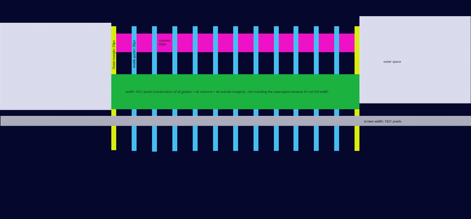
Question1: are the gutters applied by default? or the by default the system applies no gutters, just pure columns?
Question2: does foundation applies outer gutter (or outer margins) automatically?
Question3: what is the total width for a non full-width row considering screensize of 1920?
Question4: what are the sizes of the columns, gutters in this case of screen width of 1921?
Question5: how should I prepare my document if I want to follow defaults with the new XY grid?
2
Answers
In addition to the documentation info that was uncovered, I found out more information on the new XY Grid by contacting Zurb:
The XY Grid is the Default grid in 6.4+
No gutters by default. Cells can get spacing in the form of margin or padding If you add spacing between cells, it will apply on both sides of each cell.
The default width of the grid-container is 1200px. This can be changed easily. You can create a grid that is fluid width as well.
Cells are a % of the grid container or the screen width. So if you have 4 cells in a grid using the medium-3 class, each will be 25% of the width. You can also have cells be auto or shrink size. Shrink will take up the width of the content inside, and grow will expand to fill remaining space.
Find answers to all your questions by reading the Foundation for Sites 6 Docs >>