 Question posted in


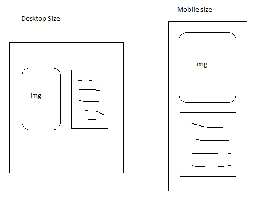
Using Twitter Bootstrap 3, I have two colummns, one with an image and the other has text. I’m trying to place the two side by side for desktop view, but then for smaller screens (mobile,tablet) the text has to fall beneath the image. I have tried various float and positions css but unsuccessful.
Code:
                        <div class="row">
                            <h2>History</h2>
                                <div class="col-md-6">
                                    <img class="img-rounded" src="img/fldry-ban.png"/>
                                        </div>
                        <div class="col-md-6">
                            <p> text  </p>
                                </div>
                                    </div>
                                        </div>
If anyone has the time to provide some details of what CSS i should be using, I would be greatly appreciated. 🙂
2
Answers
By now you’re just telling the browser: “Hey, if I am on a medium screen device (col-md-6) let’s take 6 out of 12 blocks for displaying!”
You need to add the class for the mobile view too:
So now, the mobile browser also knows, that he should use the full 12 blocks to display.
For further information about how to use the grid system of bootstrap take a look at this.
try this