skip to Main Content

I’d like to use Twitter Bootstrap for one project which has a bit of a crazy layout.

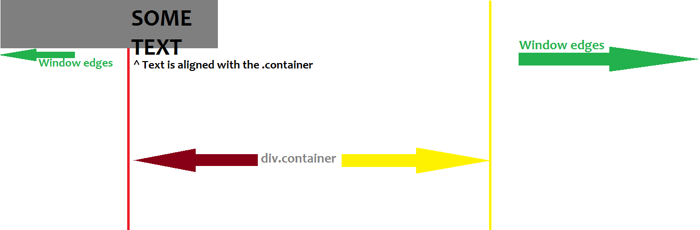
The logo’s background should start from the edge of the window, but the text in the logo should start where the .container begins.
Crazy, huh!

I’m not sure how to explain this so I drew it!
enter image description here

What I’ve done so far is this:

<div class="container">
  <header>
    <div id="logo" class="pull-left col-sm-3 bg-theme">
      <div class="typography">
        Dope
        <br/>
        Text
      </div>
    </div>
    <div class="col-sm-9">
      <nav class="pull-right"> nav should be here </nav>
    </div>
  </header>
  <!-- header -->
</div>


#logo {
  position: relative;
  height: 100px;
  background: #ffd800;
}

.typography {
  position: absolute;
  right: 0px;
  top: 20px;
  line-height: 50px;
  font-size: 50px;
  font-weight: bold;
}

I created a demo@jsFiddle.

How should I structure my HTML, or what can I do with the CSS to achieve this effect.

CSS only solutions if possible.

Edit: Those kind of title element might appear on the page again, so solutions which are based on the fact that the element will be at the top of the page are not what I’m after.

6

Answers


  1. would something like this work? http://jsfiddle.net/swm53ran/312/

    if you want to see how the structure could happen over and over again, you could just add the sectioned off divs like in this fiddle: http://jsfiddle.net/swm53ran/313/

    <div class="body">
      <div class="header col-xs-12">
        <div class="row">
          <div class="title col-xs-offset-1 col-xs-5">
            This is the title
          </div>
          <div class="nav col-xs-5">
            This is your nav
          </div>
        </div>
      </div>
      <div class="container col-xs-10 col-xs-offset-1">
        This is where your content goes.
      </div>
    </div>
    
    Login or Signup to reply.
  2. Use the grid system to isolate header and body:

    <div class="container">
      <div class="row">
         <div class="col-md-4">.col-md-4</div>
         <div class="col-md-8">.col-md-8</div>
      </div>
      <div class="row">
         <div class="col-md-2">.col-md-2</div>
         <div class="col-md-4">.col-md-8</div>
         <div class="col-md-2">.col-md-2</div>
      </div>
    </div>
    
    Login or Signup to reply.
  3. Use .container-fluid for the content you want to be full width instead of the fixed-width that comes with .container.

    Per Bootstrap:

    • Rows must be placed within a .container (fixed-width) or .container-fluid (full-width) for proper alignment and padding.

    If you want container-fluid to go the absolute edge of the window, you can set padding: 0; like:

    .container-fluid {
      padding: 0;
    }
    

    Here’s a fiddle demo for you to review. http://jsfiddle.net/xsqezfro/ (I put a border around .container so you can see the div.

    Login or Signup to reply.
  4. I recommend making the following changes.

    1. Start by making a .container-fluid
    2. Then move your .container into your .container-fluid
    3. lastly, move your header above your .container, but inside your .container-fluid

    Once complete it should look something like.

    <div class="container-fluid">
      <header class="col-md-12>
        <div id="logo" class="pull-left col-sm-3 bg-theme">
          <div class="typography">
            Dope
            <br/>
            Text
          </div>
        </div>
        <div class="col-sm-9">
          <nav class="pull-right"> nav should be here </nav>
        </div>
      </header>
      <!-- Header -->
      <div class="container">
        <!-- Other content -->
      </div>
    </div>
    
    Login or Signup to reply.
  5. First of all you have to take into account Grid System Rules:

    Some Bootstrap grid system rules:

    • Rows must be placed within a .container (fixed-width) or .container-fluid (full-width) for proper alignment and padding
    • Use rows to create horizontal groups of columns
    • Content should be placed within columns, and only columns may be immediate children of rows
    • Predefined classes like .row and .col-sm-4 are available for quickly making grid layouts
    • Columns create gutters (gaps between column content) via padding. That padding is offset in rows for the first and last column via
      negative margin on .rows
    • Grid columns are created by specifying the number of 12 available columns you wish to span. For example, three equal columns would use
      three .col-sm-4

    So following the above rules you can achieve what you want like this:

    Here a working JSFiddle fork from yours

    #logo {
        position: relative;
        height: 100px;
        background: #ffd800;
    }
    .container {
        height: 500px;
    }
    .typography {
        line-height: 35px;
        font-size: 35px;
        font-weight: bold;
        padding-left: 0 !important; /*only because bootstrap are overwriting my styles*/
    }
    <link href="http://maxcdn.bootstrapcdn.com/bootstrap/3.3.4/css/bootstrap.min.css" rel="stylesheet"/>
    <div class="wrapper container-fluid">
        <header>
            <div class="row">
                <div id="logo" class="pull-left col-xs-5 bg-theme">
                    <div class="row">
                        <div class="col-xs-offset-5 col-xs-7 typography">Dope
                            <br/>Text</div>
                    </div>
                </div>
                <div class="col-xs-7">
                    <nav class="pull-right">nav should be here</nav>
                </div>
            </div>
        </header>
        <div class="row">
            <div class="container col-xs-offset-2 col-xs-8">
                <p>Here you can put the content</p>
                <p>and more and more and more and more and more and more and more and more and more and more and more and more and more and more and more and more and more and more and more and more and more and more and more and more and more and more and more and more and more and more content</p>
            </div>
        </div>
    </div>

    You can change the # in col-xs-X as you wish to obtain your desire layout but always trying to follow the above rules.

    Login or Signup to reply.
  6. #logo {
      display:inline-flex;
      margin-left:-200px;
      background: #ffd800;
    }
    
    #logo .typography {
      margin-left:200px;
    }
    
    Login or Signup to reply.
Please signup or login to give your own answer.
Back To Top
Search